
Table of Contents
- Table of Contents
- The Problem with Broken Link Detection
- What You'll Need
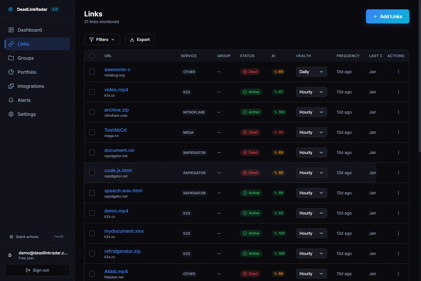
- Understanding the Dead Link Checker Portfolio Dashboard
- Service Distribution Analysis
- Status Breakdown & Health Patterns
- Automated Insights & Recommendations
- Using Insights to Optimize Monitoring
- Pro Tips
- Real-World Example
- Frequently Asked Questions
- Summary & Next Steps
- Related Posts
The Problem with Broken Link Detection
You're using a broken link checker to monitor hundreds of links across multiple file hosting services—K2S, Rapidgator, Mega, Google Drive, Nitroflare—and your monitoring dashboard shows green checkmarks. Everything looks fine. But hidden beneath the surface, patterns emerge: 85% of your links are concentrated on a single service that's been having reliability issues. Half your Rapidgator links are dead, but you wouldn't know it without digging through pages of individual link statuses.
This is the problem with traditional link monitoring: it tells you if a link is broken, but not why your portfolio is vulnerable or how to optimize your broken link checker strategy.
Without visibility into your link composition and health patterns, you're flying blind. You can't identify concentration risks that could take down your entire portfolio if one service fails. You can't spot which file hosts are causing the most problems. And you can't make data-driven decisions about which links deserve closer monitoring and which can be checked less frequently.
The Portfolio Analysis Dashboard solves this by revealing exactly what's working and what needs your attention. Instead of checking individual links one by one, you see your entire link ecosystem at a glance—service distribution, health status patterns, and data-driven recommendations for optimization.
What You'll Need
Before diving into portfolio analysis, make sure you have:
- DeadLinkRadar account (any plan works—even the free tier with 50 links will show meaningful insights)
- At least 5-10 monitored links to see useful distribution patterns and trends
- 2 minutes to navigate to the Portfolio page and explore the dashboard
That's it. If you're already monitoring links with DeadLinkRadar, your portfolio data is ready to explore right now.
Understanding the Dead Link Checker Portfolio Dashboard
The Portfolio Analysis Dashboard lives at /dashboard/portfolio in your DeadLinkRadar account. This is your command center for understanding link composition and health at a glance.
When you first open the dashboard, you'll see three key sections that work together to give you a complete picture of your link ecosystem:
- Service Distribution Chart - Shows which file hosting services you rely on most, revealing concentration risks and diversification opportunities
- Status Breakdown Chart - Displays the health of your links (Active, Dead, Unknown) as percentages, helping you spot problems before they escalate
- Insights Panel - Provides personalized optimization recommendations based on your actual portfolio data
Each metric tells a story. Total link count shows your monitoring scale. Service distribution reveals dependencies that could become single points of failure. Status percentages indicate overall link health and potential user experience issues.
The dashboard updates in real-time as we check your links, so you always see current data without manually refreshing or running reports.

Service Distribution Analysis
The service distribution chart is where you discover hidden dependencies in your link portfolio. This chart breaks down your links by file hosting provider—showing you exactly how many links you have on K2S, Rapidgator, Mega, Google Drive, Nitroflare, and other services.
Why does this matter? Because concentration risk is one of the biggest threats to link availability. If 80% of your links are on a single service and that service experiences downtime, rate limiting, or permanent shutdown, your entire content ecosystem could collapse overnight.
The chart uses a pie or bar visualization to make concentration immediately obvious. When you see that one service dominates your portfolio, that's your signal to diversify. Ideally, you want your links spread across multiple reliable services—if one goes down, the others keep working.
Here's what to look for:
- Dominant services - Any service hosting more than 50% of your links creates concentration risk
- Service reliability patterns - If you notice certain services appear frequently in your dead links, consider migrating to more reliable alternatives
- Diversification gaps - Relying on only 1-2 services means you're vulnerable to service-specific issues
The service distribution analysis isn't just about risk—it's also about optimization. If you discover you're paying for premium plans on multiple services but only using one heavily, you might consolidate to save costs. Or if you see that one service consistently delivers better uptime, you might prioritize it for critical links.

Status Breakdown & Health Patterns
The status breakdown chart is your health scorecard, showing what percentage of your links are Active, Dead, or Unknown. This single visualization tells you immediately whether your portfolio is healthy or needs attention.
Here's how to read the status percentages:
- Active - Links that are verified working and accessible to users
- Dead - Links confirmed broken, returning errors, or showing "file not found"
- Unknown - Links not yet checked or where status couldn't be determined
The ratios between these statuses reveal the health of your entire link ecosystem. A healthy portfolio typically shows:
- Active: 85-95% - Most links should work reliably
- Dead: <10% - Some link churn is normal, but keep it low
- Unknown: <5% - Should be minimal once initial checks complete
When you see concerning patterns, investigate immediately:
- Dead links >10% - Users are hitting broken links regularly, hurting experience and SEO
- Unknown >15% - Monitoring may not be running properly, or services are blocking checks
- Active <80% - Serious portfolio health issues requiring urgent cleanup
The status breakdown also helps you prioritize link maintenance. If you see 15% dead links concentrated in one service (visible by combining this with the service distribution chart), you know exactly where to focus your cleanup efforts.
Beyond the percentages, watch for trends over time. Is your dead link percentage increasing? That suggests either service reliability problems or links aging out. Is it staying constant? Your monitoring and maintenance workflow is working well.
Automated Insights & Recommendations
This is where the Portfolio Dashboard becomes more than just charts—it becomes your strategic advisor. The system analyzes your portfolio data and generates personalized insights that would take hours to discover manually.
The system considers multiple factors when generating recommendations:
- Service concentration - Identifies single points of failure in your portfolio
- Health patterns - Spots correlations between services and link failure rates
- Monitoring efficiency - Suggests check frequency adjustments based on actual link stability
- Cost optimization - Recommends ways to reduce unnecessary checks without sacrificing coverage
Here are examples of insights you might see:
"45% of your links are on K2S. Consider diversifying to reduce concentration risk." This insight flags dependency on a single service. If K2S experiences issues, nearly half your links could be affected. The system suggests migrating some links to alternative services for better resilience.
"Your Rapidgator links have a 20% failure rate compared to 5% on other services." This reveals a service-specific reliability problem. The system might recommend checking Rapidgator links more frequently, or migrating critical content to more reliable services.
"Links checked in the last 24 hours are 98% stable. Reduce check frequency to weekly to save resources." When links prove consistently reliable, the system suggests reducing monitoring frequency. This saves monitoring checks, reduces server load, and optimizes your plan usage—without sacrificing link health confidence.
"Create a priority group for your top 50 most-accessed links and check them daily." The system identifies high-value links that deserve closer attention. By grouping these separately with daily checks, you ensure your most important content stays reliable while less critical links can be checked less often.
Each insight is based on proven best practices and your actual portfolio data. These data-driven recommendations help you optimize your monitoring strategy and improve link reliability.

Using Insights to Optimize Monitoring
Automated insights are only valuable if you act on them. Here's how to turn recommendations into concrete optimizations that improve your monitoring efficiency and link reliability.
When the system suggests diversifying service concentration:
- Identify which links on the over-concentrated service are most critical
- Re-upload those files to alternative services (Mega, Google Drive, etc.)
- Update your content to point to the new links
- Monitor the migration with link groups to ensure smooth transition
- Gradually phase out the old links once the new ones prove stable
When the system flags service reliability issues:
- Create a dedicated link group for the problematic service
- Increase check frequency to daily or hourly for those links
- Set up alerts to notify you immediately when links in that group fail
- Document the reliability issues and consider switching services for new uploads
- Monitor the group's health percentage—if it stays below 80%, plan a migration
When the system recommends reducing check frequency:
- Verify the stability claim by reviewing link history over the past 30 days
- Create a "Stable Links" group and move consistently reliable links there
- Adjust the group's check frequency to weekly or even monthly
- Monitor for 2-3 weeks to ensure link health remains stable
- If issues emerge, increase frequency again—you can always adjust
When the system suggests creating priority groups:
- Identify your most-accessed or business-critical links (use analytics if available)
- Create a "High Priority" link group in your dashboard
- Move those links to the new group and set daily check frequency
- Configure immediate notifications for any failures in this group
- Keep the group size reasonable (20-50 links) to avoid alert fatigue
The key to successful optimization is gradual implementation. Don't make sweeping changes all at once. Test recommendations on a small subset of links first, monitor the results, and scale up once you're confident in the approach.
Track the impact of your optimizations by comparing portfolio health before and after changes. Did reducing check frequency save monitoring checks without increasing dead link percentage? Did diversifying services improve overall uptime? Use the portfolio dashboard to measure success.
Pro Tips
Here are expert strategies for getting the most value from portfolio analysis:
Check your portfolio weekly to spot trends early. Set a recurring calendar reminder to review the dashboard. Catching gradual changes (like a service becoming less reliable) early prevents larger problems later.
Act on automated recommendations immediately. When the system flags concentration risk or reliability issues, prioritize those actions. Waiting until a service fails is too late—proactive optimization prevents outages.
Use insights to justify plan upgrades. If the system recommends daily checks for 200 links but you're on a plan that only supports 100, the portfolio data gives you a clear business case for upgrading. Show stakeholders the ROI of better monitoring.
Export data for stakeholder reports. Use the Export button to generate CSV or JSON files showing portfolio composition and health metrics. Include these in monthly reports to demonstrate monitoring effectiveness and link reliability trends.
Combine portfolio analysis with link groups. Create groups based on portfolio insights (e.g., "High-Risk Service" or "Stable Links") to implement targeted monitoring strategies. This makes insights actionable within your existing workflow.
Monitor seasonal patterns. Some file hosting services experience higher downtime during certain months or times of day. Track these patterns in your portfolio history and adjust check schedules accordingly.
Set up alerts for portfolio health thresholds. Configure notifications to trigger when dead link percentage exceeds 10% or when any single service's failure rate spikes. This creates an early warning system for portfolio health issues.
Real-World Example
Let's look at how a content creator used portfolio analysis to dramatically improve their link reliability while reducing monitoring costs.
Before Optimization:
Sarah manages a digital content library with 450 download links across multiple file hosting services. Her initial portfolio showed serious problems:
- Service distribution: 75% concentration on K2S, 15% Rapidgator, 10% other services
- Status breakdown: 68% Active, 18% Dead, 14% Unknown
- Monitoring cost: Checking all 450 links daily consumed her entire API quota
- User complaints: Frequent reports of broken download links hurting her reputation
The system flagged three critical issues: dangerous concentration on K2S, unexpectedly high failure rate on Rapidgator, and inefficient monitoring of stable links.
Actions Taken Based on Automated Insights:
- Diversified K2S concentration - Migrated 150 critical links to Mega and Google Drive, reducing K2S concentration from 75% to 45%
- Created priority groups - Identified her top 100 most-accessed downloads and set daily checks, reduced other links to weekly checks
- Addressed Rapidgator issues - Discovered that Rapidgator links older than 90 days had 45% failure rate; replaced old links with fresh uploads
- Implemented smart monitoring - Used link groups to check new uploads daily for first month, then weekly once proven stable
After Optimization (3 months later):
| Metric | Before | After | Improvement |
|---|---|---|---|
| Active links | 68% | 91% | +23% |
| Dead links | 18% | 3% | -15% |
| Service concentration | 75% K2S | 45% K2S | Diversified |
| Monitoring checks per day | 450 | 180 | 60% reduction |
| User complaints | 8 to 12 per month | 0 to 1 per month | 92% reduction |
| Monitoring cost | $79 per month | $39 per month | $480 per year savings |
The portfolio analysis didn't just fix Sarah's broken links—it transformed her entire content distribution strategy. By understanding her portfolio composition and acting on automated insights, she achieved higher reliability with lower costs.
The most surprising result? Her users noticed. Positive feedback increased, with multiple users commenting that downloads "just work now." That reputation improvement is impossible to quantify but directly impacts her business success.
Frequently Asked Questions
How often should I check my portfolio?
Check your portfolio weekly to spot trends and catch issues early. For high-traffic sites or critical links, consider daily checks. Use the automated insights to guide how often you review your analytics—if the dashboard shows stable patterns week over week, you might reduce review frequency. However, never go more than a month without checking, as service reliability can change quickly.
What percentage of dead links is acceptable?
Ideally, keep dead links below 5%. If you see 10% or more dead links, investigate immediately. Some industries tolerate higher percentages (especially for archived content), but lower is always better for user experience and SEO. Search engines penalize sites with too many broken links, and users lose trust when downloads consistently fail.
Can I export portfolio data?
Yes! Use the Export button in the dashboard to download your portfolio data as CSV or JSON. This is useful for stakeholder reports, tracking trends over time, or integrating with other analytics tools. The export includes service distribution, status breakdown, and historical data so you can create custom visualizations or compare portfolio health across different time periods.
Does portfolio analysis work on the free plan?
Yes, portfolio analysis works on all plans including the free tier. Free accounts can monitor up to 50 links, which is enough to see meaningful service distribution and status patterns. Automated insights are available to all users, though paid plans get more detailed recommendations based on their larger link portfolios. If you're just starting, the free plan is perfect for understanding how portfolio analysis works.
How accurate are the automated recommendations?
Automated recommendations are based on industry best practices and your actual link health data, making them highly accurate for identifying concentration risks and optimization opportunities. The system analyzes your portfolio patterns to spot issues that might not be obvious when viewing links individually. However, always consider your specific use case when implementing suggestions—these are data-driven guidelines, not rigid rules.
Can I see historical portfolio trends?
Yes, the dashboard shows historical trends for service distribution and link health over time. Toggle between different time ranges (7 days, 30 days, 90 days, 1 year) to spot gradual changes in your portfolio composition. This helps you measure the impact of optimization efforts and identify seasonal patterns in service reliability.
What if I have links on services not shown in the dashboard?
The dashboard groups less common services under "Other" to keep the view clean and focused on your primary services. You can expand the "Other" category to see all services individually. We support 40+ file hosting services including K2S, Rapidgator, Mega, Google Drive, Nitroflare, Uploaded, and many more. We continuously add support for new services based on user requests—just ask if there's a specific service you need tracked.
Summary & Next Steps
The Portfolio Analysis Dashboard transforms link monitoring from reactive firefighting to proactive optimization. Instead of discovering broken links after users complain, you spot patterns and vulnerabilities before they impact your audience.
We've covered how to read service distribution charts to identify concentration risks, interpret status breakdowns to gauge link health, and act on automated insights to optimize your monitoring strategy. The dashboard gives you visibility into your link ecosystem that would be impossible to achieve manually.
The most powerful aspect of portfolio analysis isn't the charts—it's the decisions they enable. When you understand your link composition, you can make strategic choices about service diversification, monitoring frequency, and resource allocation. You can justify plan upgrades with concrete data, demonstrate link reliability improvements to stakeholders, and prevent outages before they happen.
Ready to see what your portfolio reveals?
If you're not yet monitoring links with DeadLinkRadar, sign up for free to get started. The free plan includes full portfolio analysis for up to 50 links—more than enough to see the value.
Need more monitoring capacity?
As your portfolio grows, you'll want more frequent checks and higher link limits. Compare our pricing plans to find the tier that matches your needs. Every plan includes portfolio analysis, automated insights, and customizable link groups.
Next steps for optimizing your portfolio:
- Navigate to
/dashboard/portfolioand review your current composition - Identify your top concentration risk using the service distribution chart
- Check your dead link percentage and investigate if it's above 10%
- Read the automated insights and prioritize recommendations based on your needs
- Create link groups based on insights (e.g., "High Priority," "Stable Links")
- Implement one optimization this week and measure the impact next week
Portfolio analysis is an ongoing process, not a one-time task. Check back weekly, act on new insights as they appear, and continuously refine your monitoring strategy. Your link reliability—and your users—will thank you.